Merck Campaign
Development
It is important to create assets across all media channels that are cohesive when representing a product to make a seamless experience for the viewer. When I am working on a project, I look for the best ways to adjust the designs to achieve a brand cohesiveness so that viewers can recognize the brand and their messaging across different platforms.
Belsomra Eyeconography Message Development
Belsomra had been using the same eyeconography imagery in their materials for a while and were looking to refresh the look and feel of the ads. The next page shows my rework of this imagery. I wanted to keep the ad simple and keep the eyes the focal point of the ad while still keeping the colors consistent with the brand colors.
Original Eyeconography Designs


New Eyeconography Design
This is my second rework of the eyeconography. As a contrast to the white, simplified version I had created earlier I wanted to create a darker version of the ad to match the dark blue background color the brand had been leaning into on most of their marketing materials.
I also wanted to incorporate more elements to pair with the messaging as well as change the way the eyes animated. While all the eyes used in the past showed the eyes blinking in a way to show they are tired but can’t fall asleep, I changed this animation to show the eyes moving back and forth as if you are thinking and not tired at all, as the night progresses.
Original Eyeconography Design

This is another example of how I recreated the redesign of a previous tactic and built out the same design into a different format. These are digital banner ads built to expand the reach of the new messaging and eyeconography design.

New Eyeconography Design

Belsomra
Dosing Message Development
In contrast to the full text design that was originally created, (shown on the left) the redesigned dosing message with the colors and icons works to draws more attention to the key sections of the email and creates an easily digestible message for the viewer.
Original Email Design

As a continuation of the new dosing messaging, I translated the previous dosing messaging into web banner ad format and an animated Patient Point video.
This helped bring consistency across media channels and match the Belsomra branding more than the previous banners that were in market.
Animated Patient Point Video
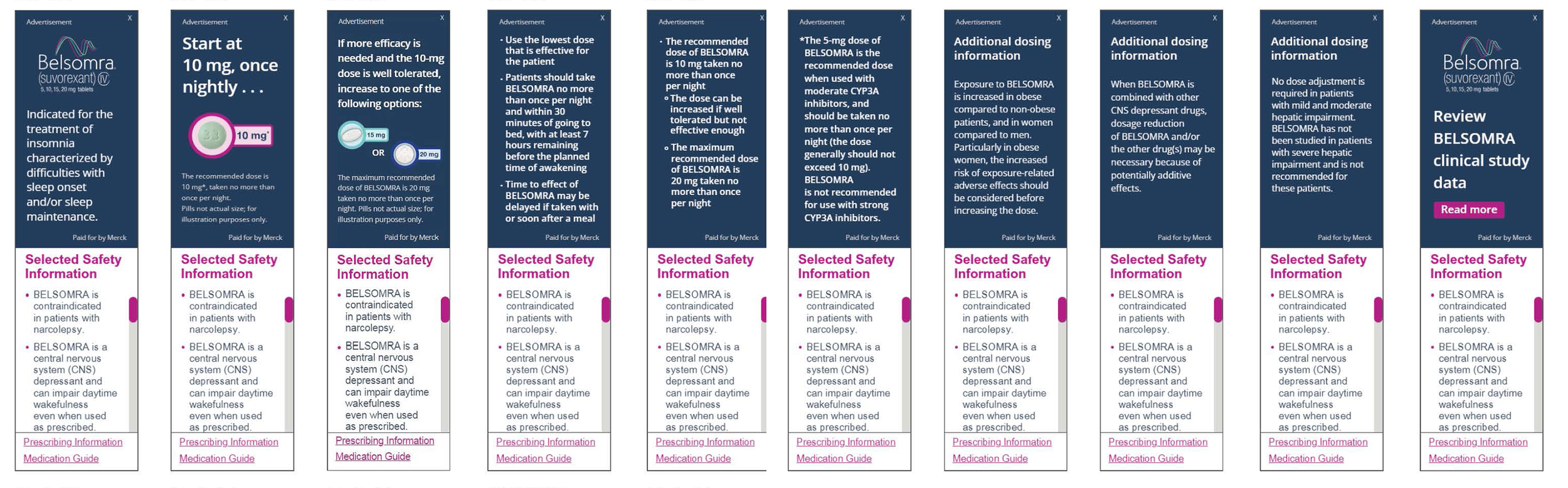
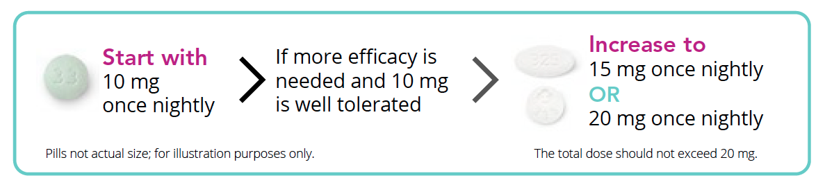
When Belsomra reworked their dosing messaging, I took the initiative to work on a new design to highlight the new messaging to emphasize the starting dose of 10mg tablet for patients.
I worked to design new icons to clearly display the three dosing options and create a layout that would still highlight the starting dose of 10mg over the other two doses. This design and icons were then used as the base for future jobs such as IVA design, Patient Point animation videos and web banners.
Original Messaging Design
Redesigned Email (Desktop)


Original Banner Ad Design
New Messaging Design

Redesigned Email (Mobile)


Redesigned Banner Ad